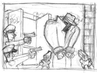
This is the rough. Basically it's showing a real badass terrorist being moved from the paddy wagon to a prison or some other secure building. I was instructed that there should be lots of guys with guns covering this guy and we needed to know he was really scary.

After my rough, my art director had some changes:
1) I pumped up the terrorist to make him look really scary but the AD wanted him to look like the rest of the generic terrorists from the game.
2) "Lose the gun hand on the right and add an arm coming from inside the building dragging/leading the prisoner inside."
3) "Add gritting teeth to the prisoner."
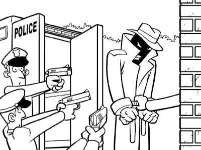
I didn't need to show the AD another rough so after making the changes I went straight into the inks. I inked these cards directly in Photoshop. I bring my rough into my image file on it's on layer and drop the opacity to about 40%. I then make another layer, title it INKS and start tracing my rough. These image files were 600 dpi, 1.5" x 2". I inked with a hard round, size 9 brush.

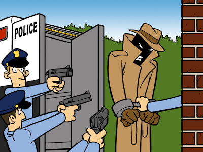
Once the image is inked I start coloring. Each color gets it's own layers and I organize all my layers into groups, ie: SPY, POLICE, BRICK WALL, etc... Organizing the colors this way makes it very easy to make corrections and change colors. Here's the image with all the flat colors.

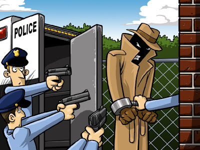
After the flats are complete I go back and make layers for all the secondary colors. Each dark and light color gets it's own layer. For these cards I'd do at least one darker color and one lighter color for each basic color. I'm not a big fan of gradients so I use them sparingly. They work well for skies and subtle shading. This image got two. I finished up the secondary colors, added the chain-link fence and clouds (which I re-used from other cards) and it's done.


No comments:
Post a Comment